The Problem with AI Presentation Tools
Most AI presentation makers work the same way. You type a topic, they generate fifteen slides from a template library, and you spend the next hour fixing the parts that do not match what you actually meant. The template fights you. The charts are decorative rather than accurate. And the output is a .pptx file that you still have to email to someone.
Claude takes a different route. It writes the entire deck as a single HTML file — your structure, your content, real charts drawn from your real numbers, and a design you can redirect with one sentence. There is no template to fight because there is no template.
Then you share it as a link. The person you send it to clicks and sees the deck full-screen in their browser, on a laptop or a phone, with no download and no "which version is this?" confusion.
This guide covers how to build one, how to make it look deliberate rather than generated, and how to handle the cases where you genuinely do need a PowerPoint file at the end.
Start with Structure, Not Slides
The single biggest mistake is asking for "a presentation about X." You get fifteen generic slides. Instead, tell Claude the argument you are making and who is hearing it.
"Build an HTML slide deck for a 15-minute internal presentation to our leadership team. The argument: our onboarding flow is losing 40% of signups between account creation and first project, and we should fund a two-sprint fix. Audience: CEO, CFO, VP Product — they care about revenue impact, not UI details. Structure it as: the problem in one number, where exactly users drop off, what it costs us per month, the proposed fix, what we need, and what success looks like in 90 days. One idea per slide. Use a dark theme with a single accent color."
Notice what that prompt does. It names the audience, the argument, the running time, and the slide-by-slide spine. Claude is genuinely good at turning that into a deck. It is much worse at guessing it.
The "one idea per slide" instruction matters more than it looks. Without it, models tend to produce dense bullet walls, because that is what most decks on the internet look like.
Give It the Real Numbers
A deck full of plausible-looking placeholder data is worse than useless in a meeting. Paste your actual figures in:
"Use these real numbers. Signups last month: 2,840. Completed account creation: 2,610. Created a first project: 1,570. Returned within 7 days: 890. Average revenue per activated user: $34/month. Build the funnel chart from these and calculate the monthly revenue left on the table."
Claude will do the arithmetic and draw the chart from those values. Always check the math on the slide that matters most — it is right the large majority of the time, and the one time it is not, it will be in front of your CFO.
Add the Things That Make a Deck Usable
A deck is not just slides. It is the machinery around them, and this is where the HTML approach pulls ahead.
Keyboard navigation. Ask for it explicitly:
"Add keyboard navigation — left/right arrows and spacebar to advance, Escape for a grid overview of all slides. Show a small slide counter in the bottom right."
Speaker notes. The notes stay hidden from the audience but available to you:
"Add speaker notes to each slide that appear only when I press 'N'. Write notes that give me the transition sentence into the next slide, not a script of the slide itself."
A presenter timer. Useful for anything time-boxed:
"Add a timer in the corner that starts when I press 'T', turns amber at 12 minutes and red at 15."
Charts that are actually charts. Claude draws these in the page rather than pasting an image, so they stay crisp at any size and you can ask it to change a single series without regenerating anything.
"Make the funnel chart interactive — hovering a stage shows the exact count and the drop-off percentage from the previous stage."
Make It Look Deliberate
The default output is clean but neutral. Two or three sentences move it a long way.
"Restyle the deck to match our brand: background #0B0F14, accent #34D399, headings in a heavy sans-serif at large sizes, body text at 24px minimum so it reads from the back of a room. Put our logo small in the bottom-left of every slide except the title slide. Keep generous whitespace — I would rather have more slides than crowded ones."
That "24px minimum" instruction is the one people forget. Decks are read from a distance, and AI-generated slides default to document-sized type.
If you want a specific visual reference, describe it rather than naming a brand:
"Style the title and section-break slides like a conference keynote — full-bleed color, a single short line of text, no bullets. Content slides stay minimal and light on chrome."
Iterate One Slide at a Time
Once the deck exists, you do not need to regenerate it to make changes. Point at the slide:
"Slide 4 is too dense. Split it into two slides: one for where users drop off, one for why we think they drop off."
"Replace the bar chart on slide 6 with a simple before/after comparison — two big numbers side by side with a percentage change between them."
"Cut slide 9 entirely and renumber."
This is the part that makes the workflow fast. Editing a deck by conversation is quicker than editing one by mouse, and it stays quick at slide 30.
Share It
When the deck is ready, ask Claude to share it and you get a link.
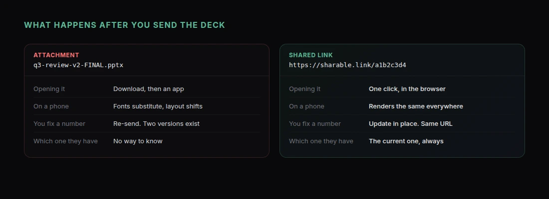
The person on the other end opens it in a browser. Full screen, arrow keys, works on a phone. Nothing to download, no font substitution disaster, no 40MB attachment bouncing off a mail server.
That matters most in three situations:
- Sending a deck ahead of a meeting. People actually open a link. Attachments sit unread.
- Following up after a pitch. The link is the same one you presented from, so there is no "cleaned-up version" to prepare.
- Async updates. Post the link in Slack and let people read it at their own pace.
If the content is sensitive, you can password-protect the page before you send it.
And because the link stays live, you can update the deck in place. Fix a number the morning after and everyone who has the link sees the correction — no "v2_FINAL_revised" in anyone's inbox.
When You Still Need a PowerPoint File
Sometimes the answer is genuinely a .pptx — a conference organizer requires an upload, or a client's brand team needs to edit your slides in their own template.
Two options:
Print to PDF. Ask for a print stylesheet and use your browser's print dialog:
"Add a print stylesheet so each slide renders as one landscape page with no navigation chrome, ready to save as PDF."
Ask Claude for the file. Claude can generate a real .pptx directly if you ask for one. You lose the interactivity and the link, so it is worth doing only when the file itself is the requirement.
For most internal and client work, the link is the better artifact. It opens faster, it stays current, and you can tell how it rendered on the other end because there is only one rendering.
A Realistic Time Estimate
A first draft of a ten-slide deck takes a few minutes. Getting it genuinely good — right numbers, right emphasis, brand styling, speaker notes — takes another twenty or thirty. Call it half an hour for something you would be comfortable presenting to your leadership team.
That is not "instant," and anyone promising instant is selling a template. But it compares well to the two or three hours the same deck takes in PowerPoint, and the output is a live URL rather than a file.
Get Started
If you want to see the range of what Claude produces before committing to a deck, Claude Artifacts Examples covers ten other formats. For a client-facing document rather than a presentation, How to Build a Client Proposal with Claude is the closer fit.
Here is the shortest path to a shared deck:
- Add the Claude connector — one click, nothing to install
- Write out your argument and audience before you write the prompt
- Paste in your real numbers
- Ask for keyboard navigation and speaker notes
- Fix individual slides by pointing at them
- Ask Claude to share it, and send the link
Your next deck is a conversation and a URL.