
Nobody Updates a Diagram They Have to Drag
Every team has the same diagram problem. Someone drew the architecture in a drawing tool eighteen months ago. It was accurate for about a month. Now it is wrong in four places and nobody will fix it, because fixing it means opening the tool, finding the file, re-aligning twelve boxes, and re-exporting.
The cost is not the drawing. It is the maintenance.
Describing a diagram in text changes that. You tell Claude what connects to what, it produces the diagram, and when the system changes you change a sentence. That is a small enough edit that it actually happens.
This guide covers the diagram types worth generating this way, how to describe a system so the layout comes out readable, and what to do when the auto-layout fights you.
Text-Defined Diagrams, Briefly
The mechanism underneath is worth thirty seconds of your attention, because it explains both the strengths and the limits.
Instead of positioning shapes, you write a description of the relationships:
``
flowchart TD
A[User submits form] --> B{Valid?}
B -->|Yes| C[Save to database]
B -->|No| D[Show errors]
D --> A
C --> E[Send confirmation email]
``
The layout engine positions everything. You never place a box or route an arrow.
The upside is enormous for maintenance: adding a step is one line, and everything re-flows. The trade-off is that you give up precise control of position — you describe structure, and the engine decides geometry.
For system diagrams, that trade is almost always worth it. For a pixel-exact marketing graphic, it is not.
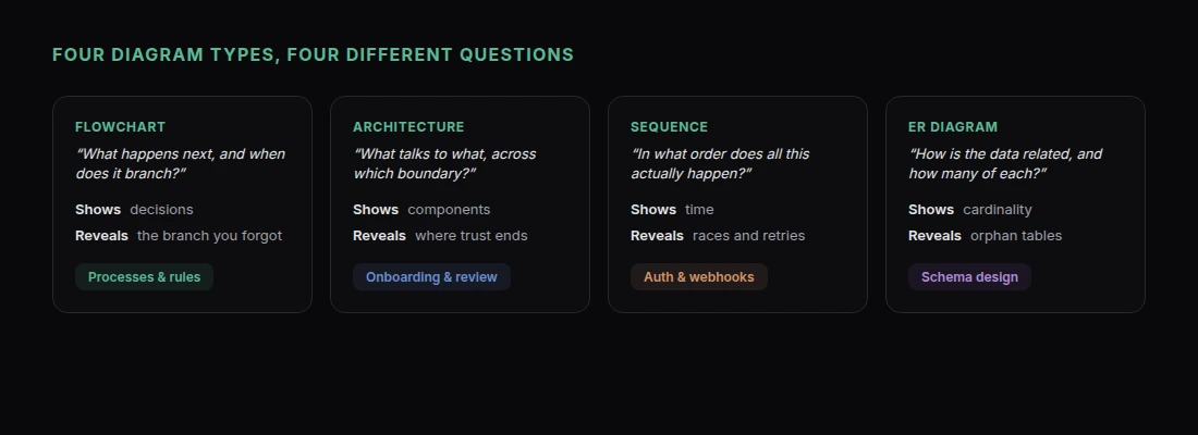
Flowcharts and Decision Trees
The most common request, and the one with the clearest payoff.
"Draw a flowchart of our refund process. A customer submits a refund request. If the order is under 30 days old and under $200, it is auto-approved and refunded immediately. If it is under 30 days but over $200, it goes to a support lead for review — they approve or deny, and either way the customer is notified. If the order is over 30 days old, it is automatically declined with a link to our policy, unless the customer has an active enterprise contract, in which case it goes to their account manager. Use a top-down layout, diamonds for decisions, and color the three terminal outcomes differently: green for refunded, amber for manual review, red for declined."
Write the process as prose and let Claude turn it into structure. That is faster than trying to write the diagram syntax yourself, and it catches things — the enterprise exception above is exactly the branch people forget until they see the shape of the chart.
If the result is unwieldy:
"This is too wide to read. Switch to a left-to-right layout and collapse the two notification steps into a single node."
Architecture and System Diagrams
Good for onboarding docs, design reviews, and anything where a new person needs the shape of the system.
"Draw an architecture diagram for a web app: a Next.js frontend on Vercel, a Postgres database on Neon, file storage in blob storage, authentication through an OAuth provider, and a background worker that processes uploads from a queue. Show the request path from browser through to database. Group the managed services visually and separate them from our own code. Label each arrow with the protocol or purpose rather than leaving them bare."
Two instructions that consistently improve these:
Label the arrows. An unlabelled arrow between two boxes conveys almost nothing. "writes session" or "polls every 30s" conveys a lot.
Group by boundary. Trust boundaries, network boundaries, or ownership. That is usually the thing a reader most needs to see.
"Draw a dashed boundary around everything that runs inside our VPC, and mark the two points where traffic crosses it."
Sequence Diagrams
The right tool whenever the question is "in what order does this happen?" — auth flows, webhooks, retries, anything with a race condition.
"Draw a sequence diagram of our OAuth login flow. Participants: Browser, Our App, Auth Provider, Database. Show: user clicks login, app redirects to provider with a state parameter, user authenticates, provider redirects back with a code, app verifies the state, app exchanges the code for tokens server-side, app looks up or creates the user row, app sets a session cookie, browser lands on the dashboard. Mark the token exchange clearly as server-to-server, and add a note on the state check explaining that it prevents CSRF."
Sequence diagrams are where this approach beats drawing tools most decisively. Inserting a step in the middle is one line of text; in a drawing tool it means moving everything below it.
Entity Relationship Diagrams
Useful for a database you are designing, and even more useful for one you inherited.
"Draw an ER diagram for a multi-tenant SaaS: organizations, users, memberships joining them with a role, projects belonging to an organization, and tasks belonging to a project with an optional assignee. Show cardinality on every relationship and mark primary and foreign keys."
If the schema already exists, skip the description entirely:
"Here is our schema.sql [paste]. Draw the ER diagram from it, and flag any table with no foreign key relationships."
That last clause turns a drawing exercise into a review. Orphan tables are usually either dead or a bug.
Making the Layout Readable
Auto-layout is good, not perfect. Four fixes handle nearly everything:
Change direction. Tall diagrams read better in documents; wide ones read better on slides.
"Switch to left-to-right — this is going on a slide."
Split it. A diagram with forty nodes is not a diagram, it is a wall.
"This is too dense. Split it into two: one showing the request path, one showing the background jobs, with a shared label where they connect."
Shorten the labels. Long node text forces the engine to space everything out.
"Cut every node label to four words or fewer and move the detail into a legend."
Use color meaningfully. Color should encode something, not decorate.
"Color nodes by ownership: blue for our services, grey for third-party, amber for anything deprecated."
Where to Put the Finished Diagram
Ask Claude to share it and you get a link — a page that renders the diagram cleanly at any screen size.
That solves the problem the introduction started with. Paste that link into your README, your onboarding doc, your Slack channel, your design review. When the system changes, update the page and the link keeps working. Everyone who has it sees the current version, because there is only one version.
Compare that to the usual outcome: a PNG exported eighteen months ago, pasted into three documents, all of them now wrong, with the editable source in someone's personal drive.
For a diagram that needs to sit inside a longer explanation, put both on the same page:
"Put the architecture diagram at the top of a page, and below it add a short section per component explaining what it does and who owns it."
If it documents something you would rather not have indexed, password-protect the page.
What This Does Not Replace
Precise visual design. If you need a diagram positioned exactly, with custom illustration and brand-specific styling, a design tool is still the answer.
Whiteboarding. Thinking out loud with other people in real time is a different activity. Use this to capture the conclusion afterwards.
Very large systems. Past roughly thirty nodes, auto-layout produces something technically correct and practically unreadable. Split it into layers.
For flowcharts, architecture, sequences, and schemas — the diagrams most teams actually need and most teams let rot — describing them in text is the version that stays true.
Get Started
For related documentation work, What Is an HTML File? explains why a single self-contained page travels so well, and Claude Workflow for Client Reports covers the same technique applied to recurring documents.
To draw your first one:
- Add the Claude connector — one click, nothing to install
- Describe the process or system in plain prose, including the exceptions
- Name the diagram type: flowchart, architecture, sequence, or ER
- Ask for labelled arrows and meaningful grouping
- Fix the layout with direction, splitting, or shorter labels
- Ask Claude to share it, and paste the link into your docs
Then update the sentence instead of redrawing the boxes.