
What Makes Claude a Great Report Generator
Most AI report generators give you a wall of text. Maybe some bold headings. If you are lucky, a table. The output looks like a first draft that still needs an hour of formatting before you can send it anywhere.
Claude is different because it generates complete HTML reports — not just text, but fully styled documents with charts, tables, color-coded sections, and professional layouts. The output looks like something a design team produced, not something a chatbot spit out.
And here is the part that matters for your workflow: once the report is ready, you type /share and it is live at a sharable.link URL. Send the link to your team, your client, or your leadership. They open it in their browser and see a polished, interactive report. No PDF attachments, no formatting that breaks in email, no "can you resend that in a different format" replies.
That combination — quality output plus instant sharing — is what makes Claude the best AI report generator for professional use.
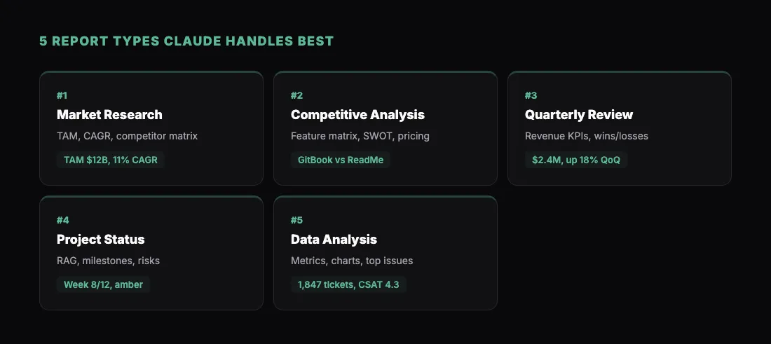
Five Report Types with Prompts
Here are five types of reports that Claude handles exceptionally well. Each prompt below is ready to use. Paste it into Claude, swap in your own data or topic, and you will have a shareable report in minutes.
1. Market Research Report
"Create a comprehensive market research report on the project management software market. Include: an executive summary with key findings, market size and growth projections (TAM $12B, growing 11% CAGR), a competitive landscape section profiling 5 major players with a comparison matrix, market segmentation by company size and industry, key trends driving adoption, and a strategic recommendations section. Use charts for market size projections and competitive positioning. Professional layout with a table of contents."
Market research reports are one of Claude's strongest areas. It structures the information logically, picks the right chart types for the data, and creates a layout that executives actually want to read.
2. Competitive Analysis Report
"Build a competitive analysis report comparing our product (a developer documentation tool) against three competitors: GitBook, ReadMe, and Mintlify. For each competitor, include: pricing tiers, key features, target audience, strengths, and weaknesses. Add a feature comparison matrix with checkmarks and X marks. Include a SWOT analysis for our product relative to the market. End with strategic recommendations. Use a clean, professional design with comparison tables and color-coded ratings."
This type of report is valuable for product teams, sales enablement, and board presentations. The comparison matrix alone saves hours of manual formatting.
3. Quarterly Business Review (QBR)
"Create a QBR report with the following data: Revenue $2.4M (up 18% QoQ), customers 340 (up 12%), churn rate 3.2% (down from 4.1%), NPS 68 (up from 62). Include: an executive summary, revenue breakdown by segment (Enterprise 60%, Mid-Market 30%, SMB 10%), a chart showing quarterly revenue trend for the last 6 quarters, top wins and losses, a product roadmap update section, and next quarter goals. Use KPI cards at the top and charts throughout. Professional layout suitable for board distribution."
QBR reports are the most common use case we see at sharable.link. Teams build them in Claude every quarter and share the link with stakeholders. It beats a 40-slide deck every time.
4. Project Status Report
"Build a project status report for a mobile app development project at week 8 of 12. Include: a project health summary with red/amber/green indicators for timeline (amber), budget (green), scope (green), and quality (green). Add a milestone tracker showing completed and upcoming milestones. Include a risk register table with likelihood and impact ratings. Show a burndown chart for the current sprint. Add sections for accomplishments this week, blockers, and next steps. Use a clean dashboard-style layout."
Project reports benefit from visual indicators — RAG status, progress bars, burndown charts. Claude builds all of these into the HTML, making the report genuinely useful rather than just a text summary.
5. Data Analysis Report
"Create a data analysis report on customer support ticket trends. Data: total tickets this month 1,847 (up 8%), average resolution time 4.2 hours (down 12%), CSAT score 4.3/5, top categories: billing (32%), technical (28%), onboarding (22%), feature requests (18%). Include: a summary with key metrics, a pie chart for ticket distribution by category, a line chart showing ticket volume over the last 6 months, a bar chart comparing resolution time by category, a table of the top 10 most common specific issues, and a recommendations section for reducing ticket volume. Professional styling with data-focused layout."
Data analysis reports showcase Claude's ability to turn raw numbers into a visual narrative. The combination of charts, tables, and written analysis creates a report that tells a complete story.
How to Get the Best Results
Include your actual data. Claude generates better reports when it works with real numbers rather than placeholders. Paste in your spreadsheet data, metrics, or key findings. The more specific your input, the more useful the output.
Specify the audience. A report for your CEO looks different from one for your engineering team. Tell Claude who will read it:
"This report is for our board of directors. Keep the executive summary concise and lead with financial metrics."
"This report is for the product team. Include technical detail and user research findings."
Request specific chart types. Claude picks reasonable defaults, but you can direct it:
"Use a waterfall chart for the revenue bridge. Use a horizontal bar chart for the competitive comparison."
Ask for a table of contents. For longer reports, a clickable table of contents at the top makes the HTML report much more navigable.
Iterate on design. After the first pass, ask Claude to adjust colors, fonts, or layout. Common tweaks:
"Match our brand colors: primary #2563EB, secondary #10B981."
"Make the charts larger and add more whitespace between sections."
Share Reports with Your Team
Once your report is ready, sharing it is a single step. With the sharable.link skill installed, type /share in your Claude conversation. Claude publishes the report and returns a link.
For reports with sensitive data — financial figures, client information, internal metrics — add password protection:
"Share this with a password"
Your recipients see a clean password entry screen. After authentication, the full report loads in their browser.
This workflow replaces the old cycle of exporting to PDF, attaching to email, and hoping the formatting survives. A link works everywhere, looks the same for everyone, and is easy to update — just rebuild the report and share a new link.
For a step-by-step guide on the full workflow, see A Simple Claude Workflow for Client Reports. If you are building reports alongside dashboards and other outputs, How to Share a Claude Dashboard covers the sharing side in more detail.
Get Started
- Install the sharable.link skill
- Pick one of the five report prompts above
- Paste it into Claude with your own data
- Review the output, iterate as needed
- Type
/shareto publish - Send the link
You will go from raw data to a shareable, professional report in under ten minutes. That is the kind of AI report generator that actually saves you time.