Why AI Image Generators Are the Wrong Tool for This
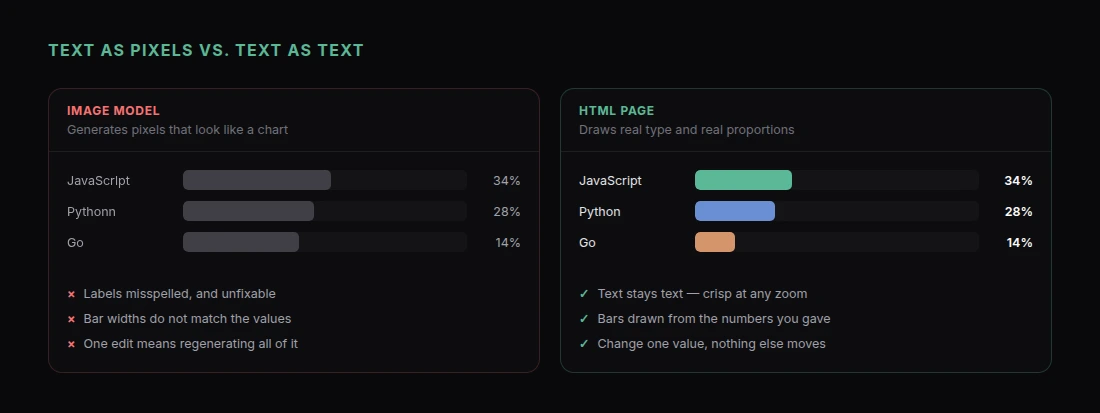
Ask an image model for an infographic and you get something that looks right from across the room and falls apart up close. Labels are misspelled or nonsense. Bar heights do not match the numbers printed beside them. The chart is a picture of a chart, so the data behind it is decorative rather than real.
That is not a prompting failure. Image models generate pixels. An infographic is mostly typography and proportion, and pixels are a bad medium for both.
There is a better route. Have Claude build the infographic as a web page — HTML and SVG rather than a generated image. The text is real text, so it is crisp at any size and spelled the way you wrote it. The bars are drawn from the numbers you supplied, so they are proportionally correct. And every element is editable by asking, rather than by regenerating and hoping.
Then you share it as a link, or export a PNG when you need a flat image.
Bring the Data, Not Just the Topic
An infographic's job is to make a specific set of numbers legible. So give Claude the numbers.
"Build an infographic as a single HTML page summarising our 2026 developer survey. Here is the data:
>
Primary language: JavaScript 34%, Python 28%, Go 14%, Rust 11%, Java 8%, other 5%.
Team size: solo 18%, 2-10 people 41%, 11-50 people 27%, 50+ 14%.
Biggest blocker: unclear requirements 38%, code review delays 24%, flaky tests 21%, deploy friction 17%.
Respondents: 1,842. Fielded March 2026.
>
Structure it as a vertical scroll: a headline stat at the top, then three sections, one per question, each with a chart and a one-line takeaway. Put the methodology line at the bottom. Portrait orientation, roughly 1200px wide."
That prompt produces something accurate because the accuracy is supplied. If you ask for "an infographic about developer trends," you get invented numbers presented confidently, which is the worst possible outcome for this format.
If You Do Not Have Clean Data Yet
Paste the messy version and let Claude do the extraction:
"Here is the raw CSV export from our survey [paste]. Count the responses per category, convert to percentages rounded to one decimal, and tell me the totals before you build anything. Then build the infographic from those figures."
Asking for the totals first is worth the extra step. You get to check the arithmetic before it is baked into a graphic you are about to publish.
Pick a Structure That Matches the Story
"Infographic" covers several quite different layouts, and naming the one you want gets you there much faster.
Statistical panel. A grid of numbers with supporting charts. Best for survey results and year-in-review pieces.
Process or timeline. Numbered steps flowing top to bottom or left to right. Best for how-something-works and history pieces.
Comparison. Two or three columns, matched rows. Best for versus content and buying guides.
Anatomy or diagram. A central object with labelled callouts. Best for explaining how a thing is put together.
"Use a process layout: 6 numbered stages running top to bottom, each with an icon, a short heading, two lines of body text, and a connecting line between stages. Highlight stage 4 as the one where most projects fail."
Make It Look Designed
The default output is tidy and generic. Design direction is where the quality comes from, and it is a paragraph of work.
"Design direction: a strict two-color palette — deep navy #12263A and a warm coral accent #F2685C — on an off-white #FAF8F5 background. One typeface at three sizes only: a large bold display size for the headline stat, a medium weight for section headings, and a light weight for body. Generous margins. No drop shadows, no gradients, no rounded corners. Numbers should be the largest thing on the page — the design should feel like a printed annual report rather than a slide."
Specific constraints beat adjectives. "Modern and clean" means nothing; "two colors, one typeface, no shadows" produces a consistent result.
A few instructions that reliably improve the output:
Let one number dominate. Every good infographic has a hero stat.
"Make the 38% blocker figure the visual anchor — set it in the largest type on the page with everything else subordinate to it."
Charts drawn to scale, labelled directly.
"Draw the charts as inline SVG. Label each bar directly with its value rather than using a separate legend."
Real whitespace.
"Increase the vertical spacing between sections substantially. I would rather the page be longer than crowded."
Editing Is the Real Advantage
Because the infographic is a page rather than an image, you can change one thing without touching anything else.
"The coral is too loud against the navy. Desaturate it about 20%."
"Swap sections 2 and 3."
"The team-size chart should be a horizontal bar chart, not a donut. Donuts make 41% and 27% hard to compare."
"One number changed — solo developers is 19%, not 18%. Update the figure, the bar, and the takeaway line."
Try any of those with a generated image and you regenerate the whole thing, get a different composition, and start over. This is the difference that matters in practice.
Getting a PNG When You Need One
Sometimes you genuinely need a flat image — a LinkedIn post, a slide, a print layout.
"Add a 'Download as PNG' button that renders the infographic to an image at 2x resolution."
Or take a full-page screenshot in your browser. Either way you are exporting from a source that stays editable, rather than editing an export.
For social specifically, ask for the aspect ratio up front:
"Also produce a square 1080x1080 version with the three key stats only, sized for Instagram."
Sharing It as a Link
Ask Claude to share it and you get a URL.
For an infographic this is better than an image file more often than people expect:
- It stays sharp. No compression artefacts, no blurry text when someone zooms in.
- It works on a phone. Ask for a responsive layout and the columns restack instead of forcing a pinch-zoom.
- You can fix it after sending. Wrong number in the third chart? Update the page; the link stays the same and everyone sees the correction.
- It can be interactive. A static image cannot show a tooltip on hover, and a page can.
"Make it responsive — on screens under 700px, stack everything into a single column and reduce the headline stat's size proportionally."
If the data is not public yet, password-protect the page before you circulate it.
Where This Approach Falls Down
Two honest limits.
Illustration. If your infographic needs original illustrated characters or scenes, Claude is not drawing those. It handles icons, shapes, charts, and typography. For illustration, generate the artwork separately and ask Claude to place it.
Print production. Anything heading to a professional printer needs CMYK, bleed, and specified colour profiles. A browser page is RGB. Fine for digital and office printing, wrong for a print run.
For the large majority of infographics — survey results, explainers, comparisons, internal one-pagers — neither limit bites.
Get Started
For related formats, AI Report Generator: Create Polished Reports with Claude covers longer data documents, and Build and Share an AI Dashboard with Claude covers the live version of the same idea.
To build your first one:
- Add the Claude connector — one click, nothing to install
- Gather the actual numbers, and have Claude confirm the totals first
- Name the layout: statistical, process, comparison, or anatomy
- Give a specific design direction — colors, type sizes, what to avoid
- Pick one hero stat and make it dominate
- Ask Claude to share it, and send the link
Real text, correct proportions, and a URL you can fix after you send it.